Introduction
The yearly Historical Materialism Conference is organized by the journal Historical Materialism: Research in Critical Marxist Theory, who describe their aims as follows: “Founded in 1997, it asserts that, notwithstanding the variety of its practical and theoretical articulations, Marxism constitutes the most fertile conceptual framework for analysing social phenomena, with an eye to their overhaul. In our selection of materials, we do not favour any one tendency, tradition or variant. Marx demanded the ‘merciless criticism of everything that exists’: for us that includes Marxism itself.”[1] The journal also produces the Historical Materialism book series published by Brill in hardback and in paperback the following year by Haymarket Books, Chicago (for which I have recently started designing the Historical Materialism book series covers).
Since 2012 I have designed the posters for the London conference in which I reuse and repurpose my artwork. The first poster, from 2012, used a stencil typeface, but from 2013 the typeface DIN 30640 Std Neuzeit Grotesk Light was introduced, which is also used on the Historical Materialism website and on the cover of the journal, to give the posters a coherent identity or “brand” within the Historical Materialism organization. This typeface is mostly used in lower case, after László Moholy-Nagy who, at the bauhaus, encouraged the abandoning of capitals, which were seen to be associated with authority and tradition.
The posters have been printed and used online, with the exception of the two most recent. In 2020 and 2021, the pandemic forced the annual conferences to take place online and the corresponding posters appeared in digital format only.

Weighs Like a Nightmare (2012) repurposes Painting 32 from the series “Rhythm 69. William Morris Block Printed Pattern Book, with Hans Richter Storyboard, developed from Richter’s Rhythmus 25 and Kazimir Malevich’s film script ‘Artistic and Scientific Film – Painting and Architectural Concerns – Approaching the New Plastic Architectural System’,” paint and wallpaper mounted on canvas, 2007, 50.8 × 40.6 cm. The Honeysuckle wallpaper pattern, designed in 1883 by May Morris, has been painted with a Malevich cross shape that transforms parts of the pattern into a black menacing silhouette. The painted cross changes the meaning of part of the pattern, which once represented beauty and hope, into a nightmarish icon of threat and despair.
 Making the World Working Class (2013) repurposes the digital montage Transitional Monument (2004). Made as a proposal for a public artwork, the image utilizes a photo of a now-demolished 1960s tower block in Liverpool. A William Morris Daisy pattern, designed in 1864, and a John Henry Dearle Iris pattern, designed in 1887 for Morris & Co., have been digitally montaged onto two exterior walls of the building. The proposal brings together the residues of the utopianism of Morris’s designs and what they have now become: nostalgic interior decoration juxtaposed with the architectural brutalism of the tower block that used to house many Liverpool dockers and their families. The patterns simultaneously appear to be part of the building, whilst remaining montaged onto and separate from it, turning what is normally inside outside and what is domestic and intimate, public. The montage proposes a monument to two past utopian aspirations, the original purpose of the block to replace slum housing in the 1960s and Morris’s utopianism. Given that the original block has now been demolished and new “traditional” housing built on the site, Transitional Monument will remain an unrealized project.

How Capitalism Survives (2014) repurposes the painting Green Engineering Object, oil paint on fabric, 2001, 106.6 × 160 cm. The photographic image is of a large piece of industrial engineering, painted on and around May Morris’s 1883 Honeysuckle wallpaper design, which is here printed on fabric. The apparently straightforward relationship between the hand and machine made is rendered problematic because the industrial object, now obsolete and skewed by nostalgia, is painted by hand, whereas the Honeysuckle fabric, which would have been originally a hand block printed wallpaper, is a contemporary mass-produced textile reproduction. In the poster these elements get synthesized through digital mass printing in a process of reappropriation and reproduction.
 Austerity and Socialist Strategy (2015) repurposes the painting Construct 67 Morris, Fruit / Malevich, Square, 2012, acrylic on paper mounted on fabric, 54.6 × 54.6 cm. In the painting the Malevich square in the center of William Morris’s Fruit design from 1886 is stripped of its fruit, flowers and leaves by being painted over with only the twigs remaining visible. Summer is turned into winter, abundance into austerity, hope into despair and utopia into dystopia.
 Limits, Barriers and Borders (2016) repurposes the painting Construct 46, Morris & Co. Arbutus / Malevich, 2006, acrylic on paper mounted on fabric, 54.6 × 54.6 cm. Here the wallpaper Arbutus designed in 1913 by Kathleen Kersey for Morris & Co. is partly over-painted—with only the fruits left untouched—by a series of differently proportioned black lines, which in the context of the poster become barriers and borders. The title is positioned behind the conference text, laid out to form a barrier in front of it.
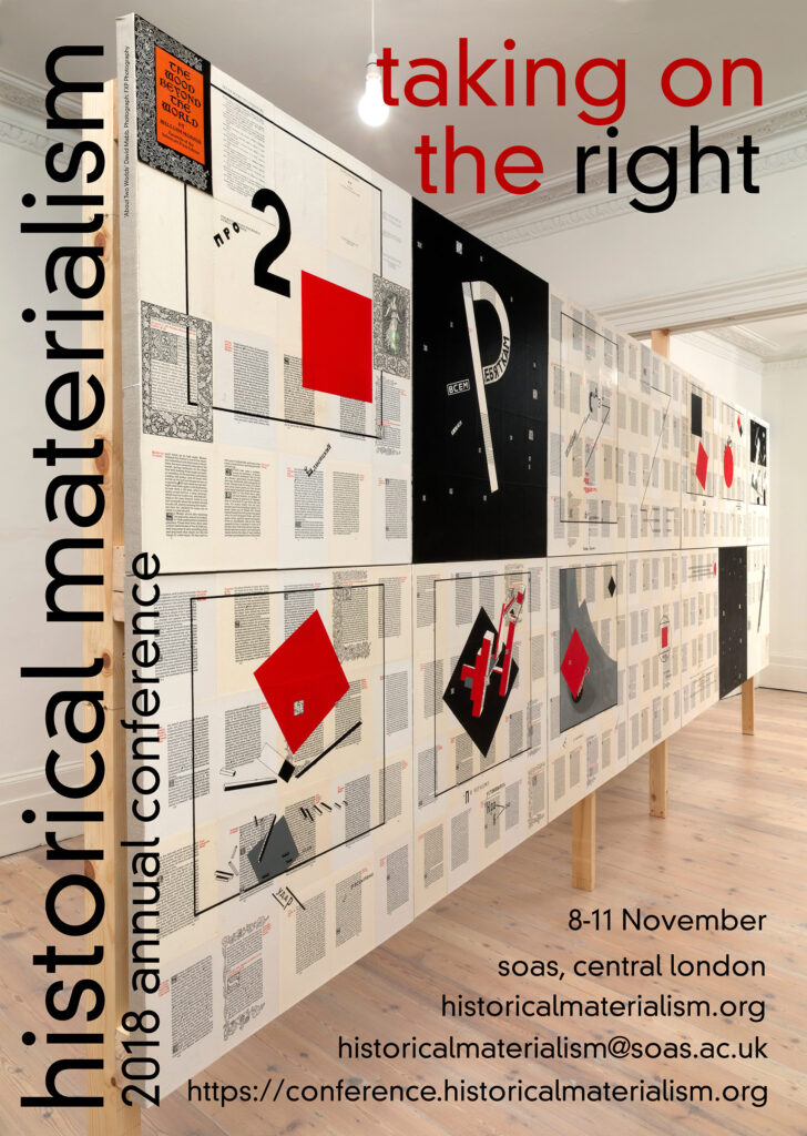 Taking on the Right (2018) repurposes the installation About Two Worlds, 2015, acrylic, varnish, pencil, facsimile edition of William Morris’s The Wood Beyond the World mounted on linen, displayed on wooden support, each section 80 × 70 cm. In the work, pages from a facsimile edition of William Morris’s Kelmscott edition of his late romantic fantasy The Wood Beyond the World, published in 1894, have been painted with enlarged recreations of pages from Russian artist El Lissitzky’s 1922 book About Two Squares. About Two Worlds brings together two facsimile utopian modernist books, both very different forms of what we might now call science fiction fantasy. Both the visual form and the written narrative of the Kelmscott The Wood Beyond the World are backward looking and informed by medieval culture. However, in El Lissitzky’s children’s story About Two Squares, the visual form and narrative is forward looking and futuristic. Whilst open to other interpretations, Sophie Lissitzky-Küppers described it as follows: “the two squares flew through the endless infinity of space; prophetic concepts were shot out of the artist’s mind and took on forms, held in counter-balance by colossal tension. The red square destroyed the black chaos on earth in order to rebuild a new red unity. The black one, having been put out of action, fled into infinity.”[2] In the context of the poster, the red square destroying the “black chaos” can be read as an allegory for taking on the right.
 Claps of Thunder: Disaster Communism, Extinction Capitalism and How to Survive Tomorrow (2019) repurposes the painting Construct 30, John Henry Dearle, Sweet Briar / Varvara Stepanova, Untitled Textile Design, 2006, paint on paper mounted on linen, 54.6 × 54.6 cm. Dearle’s Sweet Briar, designed in 1912 and Stepanova’s untitled textile design from 1924 arose in different geographic, political, and historic contexts, and are formally very different from each other, but both artists produced them as part of a commitment to the transformation of everyday life. In Construct 30, however, the separate designs come together to create a dialectical fusion where the Stepanova and the Dearle energize each other, revivifying and transforming the political content of each design to create a clash that suggests an emergent and disastrous transformation of the world.
 Survival Pending Revolution: Historical Materialism in a Pandemic Age (2020) repurposes a section from the screen print Luibov Popova Untitled Textile Design on William Morris wallpaper for Historical Materialism, 2010, screen print on wallpaper, 52 × 70 cm. It is one print from an edition of 100 originally made as a fundraiser for Historical Materialism. As a consequence of the different wallpapers used, and the random registration process, the Popova design is printed in a slightly different place on each section of wallpaper, making each print unique. Popova’s textile designs during 1923–24 are simple, bold geometric patterns in black and primary colors, sometimes with optical effects. This poster works in a similar way to the painting in Claps of Thunder: Disaster Communism, Extinction Capitalism and How to Survive Tomorrow (see above). This poster was never printed and the title was altered to HM Online 2020 when it became apparent that it was not going to be possible to hold a conference in person due to the Covid-19 pandemic.
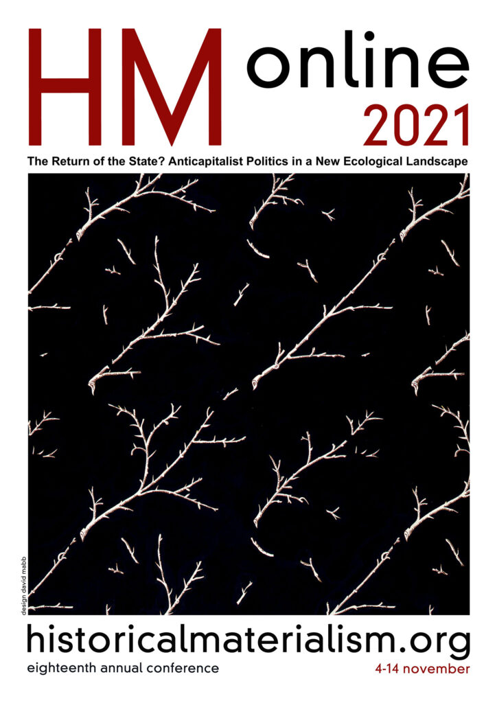 The Return of the State? Anticapitalist Politics in a New Ecological Landscape, (2021) repurposes a section from the painting Black Suprematist Rectangle, 122 x 153.5 cm, acrylic on fabric (2001). In the work, William Morris’s Fruit design is stripped of its fruit, flowers and leaves as these elements have been painted over, with only the twigs remaining visible. Again, summer is turned into winter, hope into despair, utopia into dystopia and day into night, a black version of the painting used in Austerity and Socialist Strategy above. This poster was designed so that it can be printed, but has been used as digital imagery for the Historical Materialism website and social media due to the pandemic.